Which Design Is Better?
Week 39 of Founding Typogram

Hi, I am Wenting. I recently quit my job of seven years to build my start-up, Typogram, a logo design and editing tool for startup founder. We just launched our pre-order✨! Get a one brand lifetime license at a huge discount and edit your design forever.

I have been working on the Kerning feature and need another pair of eyes on the UI design choices!
To back up a little, Kerning is a crucial feature of Typogram, where the space between letters is micro-adjusted to achieve a balanced look. The principle, as I cover in the educational material, is to imagine pouring sand into letter gaps, and we are adjusting the letter gap size, so the sand between each gap has equal volume. Alternatively, you can think of filling the gap with balloon, sometimes it is easier to imagine than sand:
 - Profile | Pinterest")
The design in question is to indicate which letter gap is being selected and adjusted.
Option A: the simplistic approach. The goal is to create a minimal UI to maximize the viewing of the letter gaps while users are adjusting. It just uses two triangles to point at the gap, and the triangles turn solid when selected.

Option B: with a light blue background to highlight the selected gap. The idea is to make the selected gap a little more prominent with the background color.
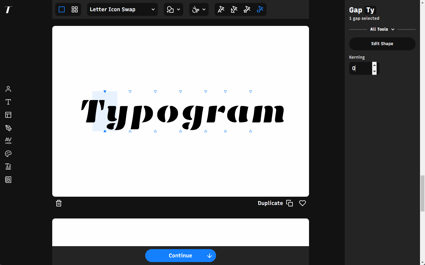
Option C: with a vertical blue stem to highlight the selected gap. I think this is the easiest to distinguish selection, which is my original design. However, I worry the vertical stem obstructs the view of the gap that users are adjusting.

Which UI choice should I go with, option A, B, or C? Let me know by replying the newsletter email or comment on this blog post! I thank you in advance to your help!
❧
See you next week! If you have friends who are interested in founding startups, please consider sharing my newsletter with them!