The Big Four Don’ts of Using Logos
Week 90 of Founding Typogram
Hey friends, I hope you are having a great week! As I am busy updating our platform to provide more robust Free Tier services, this week's newsletter is a re-run of a past issue to revisit a vital lesson on logo usage, or rather, logo misusage. Enjoy!
The Big Four Don’ts of Using Logos
The logo is designed by you or a designer that you trust. After that, the logo will need to be put on presentation slides, websites, email signatures, t-shirts, company swags, business cards, and basically, everywhere. The chances are that the person who designed the logo will not produce all the listed branded materials above. Some other people will inevitably need to get a hold of the logo file, and at that point, it is up to their discretion how to incorporate the logo into its context. They need guidelines on what to do and more importantly, what not to do. Here are four “Don’ts” in regard to logo treatment. Including them in the brand guidelines is a common practice and a good idea.
1. Don’t resize the logo disproportionally.
Squeezing and squashing the logo may be tempting to fit it into a certain cramped space, but it should be avoided at all costs. It makes the brand looks unprofessional and cheap. A trained eye will spot this amateur mistake miles away, and an untrained eye can still sense a weird tension and feel unpleased looking at it.
My friend Tim Brown wrote a book entitled Flexible Typesetting, and it coined a great notion called “pressure,” which is the tension you feel when looking at bad typography. One of the sources of pressure is a disproportionally resized text. The horizontal stroke and vertical stroke are in great proportion, carefully achieved by the typeface designer. When we change that proportion by narrowing the width and keeping the height the same, or vice versa, it instantly loses that balance:
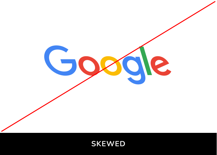
2. Don’t skew the logo.
Similarly, skewing the logo will create unnecessary pressure. Granted, skewing could work at times as a valid design approach. However, skewing is a very significant visual change for a logo and should be applied systematically with meaning and context to support it. This type of design decision should not be made when someone is using the logo for one isolated occasion; it should happen in the logo design phase with a holistic view of all logo usage. Unless it is specified with details on how to skew a logo in the brand guidelines, the default is not to skew the logo:
3. Don’t add drop shadows.
Adding a drop shadow to a logo is not unheard of. It may be tempting to do it to add more contrast with the background or add a little sense of depth, but this design change shouldn’t be done one day when someone is just adding the logo to a slide. Plus, the drop shadow on a logo gives an outdated look. By all means, keep the paws away from the drop shadow menu.
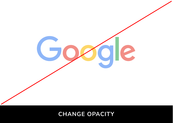
4. Don’t change the opacity.
Color is an integral part of a brand. Color becomes so prominent to a brand that we can tell Twitter and Facebook apart without text and just by their colors — they are both blue but in different shades. Accurately using the correct color is crucial to keep your brand consistent, and changing the opacity of the logo is effectively changing the color of the logo. Color with opacity becomes a slightly off-branded color; worse, when put against different backgrounds, you create different off-brand colors:
❧
See you next week! If you have friends who are interested in founding startups, please consider sharing my newsletter with them!


