Four Elements of Good Landing Pages
Week 19 of Founding Typogram
Thanks for reading my newsletter. Subscribe for free to get weekly updates about my start-up journey!
At Typogram, we are currently working on a pre-order landing page to be launched in February. As we design the landing page, we look through a lot of successful landing page examples and try to learn from their successes.
I am a design-focused and crafty person who could easily be carried away by visual design choices such as typography and layout. With this self-awareness, I need to remind myself what is more prioritized in a landing page design — it is conversion; it is to achieve business goals; it is NOT trying to win an Awwwards. I found there are four essential elements to a good landing page design:
1. Straightforward Call to Action
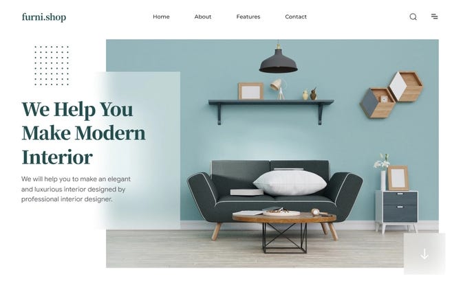
A good landing page should have a straightforward, simple, and preferably single Call to Action above the fold. Above the fold means the Call to Action should be visible without having to scroll down. It should be paired up with a clear value proposition conveyed by hero images or videos— the above-the-fold section functions as a mini landing page within the landing page. It is designed to capture the core targeted users who can be convinced at first glance.
2. Reasons to click on call to action.
For people who are not convinced at first glance at the above-the-fold section, they might be intrigued enough to scroll down. Throughout the rest of the landing page, we should provide more reasons to convince them that we provide enough value for them to click on the call to action. It could be:
what features does our product have, showcased in images or videos
past customers and their testimonials
summary of our competitive advantages, why choose us?
3. A good lasting impression.
Not all site visitors will be converted to customers on the first go. Sometimes, we are unlucky that we don’t meet our customers at the right time or the right place, but it doesn't mean we won't get a second chance further down the road. Strike a good impression, and prepare for our second encounter. Leave a good lasting impression that we are competent and delightful with beautiful site design and clear value proposition. When it comes to a time when they are in need of us, there is a better chance for us to be thought of.
4. Good SEO
All of the above elements are to convert people who have already landed on the landing page. The last element — good SEO — is to ensure more people will end up in the landing page. Think of SEO as the cover of the book and the landing page as the content of the book. People may not judge a book by its cover, but the book cover certainly affects whether or not people will pick up the book and flip through the pages. Good SEO is like a good book cover, it gets people to flip through your book.
What do you think is a good landing page example? Please share these good landing pages with us and why you liked them. It will help us a lot!
❧
See you next week! If you have friends who are interested in founding startups, please consider sharing my newsletter with them!


